My Goals
Before discussing any materials and methods it is important to begin with what I want to accomplish!
The images I wish to create should reflect my perception of the world as a bright and beautiful place filled with distinct layers upon layers of vivid colors with incredible depth. I want to create relateable images that make the viewer see the beauty around us beyond what they can see in person or in a photograph.
Materials
Although I remain open to experimenting with new materials, I have arrived at a set of materials that suit my style. Currently I use the following in my studio,
Surfaces
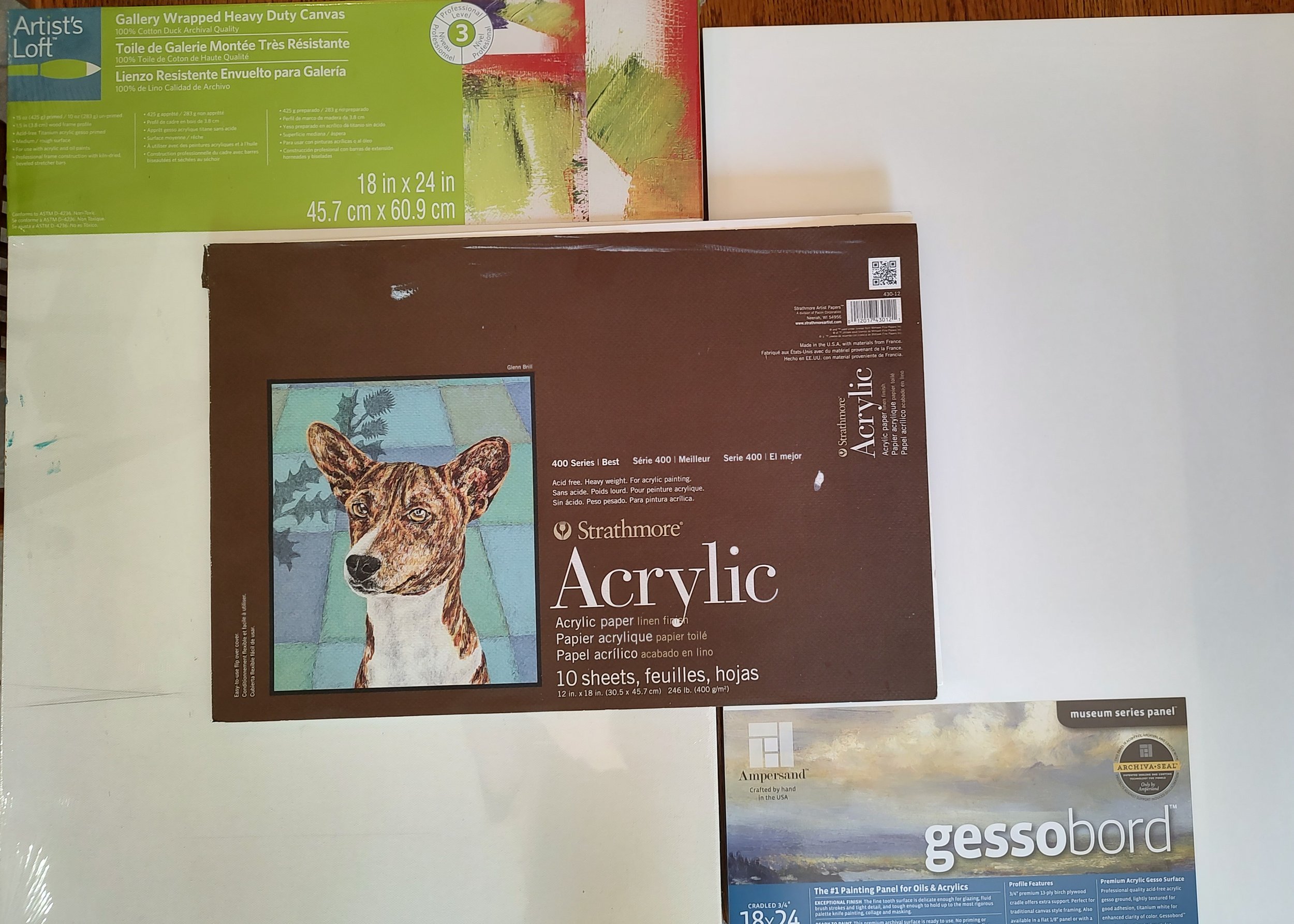
I currently work with three different surfaces, Gessoboard, Canvas, and Acrylic Paper. Each surface works differently and the choice will affect the final outcome. Let’s discuss each surface. It is relatively
1) Gessoboard (a product produced by Ampersand) is primed MDF (tradename Masonite). The advantage is that it is firm and has very little texture allowiing very sharp edges with “no bleeding”. As a consequence it is especially good for Architectural and City Scenes. It is a tough product and will not tear or stain, but it is heavy, expensive, and, since it is inflexible, can be scratched.
2) Canvas is a very versatile material with varying levels of texture and is flexible. The texture and flexiblity make architecture more challenging. However, the texture can be used to advantage when creating Landscapes, Florals, and People, since the slight softness makes the image look more natural. Canvas is suseptible to other modes of damage, most disturbing being tearing.
3) Acrylic Paper is a very heavyweight (246 lb) paper designed for use with acrylic paint. It designed to be archival and has texture. It’s more like working with watercolors except acrylics do not “re-wet” and you can paint in layers. I find it is a good surface for Florals and Landscapes and inexpensive. Disadvantages are it only available in smaller sizes and needs to be matted.
Paints and Inks
My choice of acrylic paint as a medium is dictated by my desired outcome and technique.
1) Acrylic paints are available in a host of bright, vivid colors and unlike oils, they dry rapidly so you can readily create and retain sharp edges. Further, your colors remain vibrant since, unlike oils, they do not yellow with time. The disadvantage - the medium used to supend the pigment is slightly “milky” and as it dries clear, the colors can become more intense making color matching difficult.
2) As my technique evolved to include ink highlights over paint, acrylics provide an excellent surface for the inks. (One could never do this with oils.) My ink choices have evolved. I started using India Ink, which will last centuries, but good acrylic ink pens, with acceptably fine nibs, have become available and I have migrated to acrylic ink. (The acrylic ink dries faster and adheres slightly better.)
I have also migrated from heavy body acrylics to fluid acrylics. The smoother texture, faster drying times, and slightly rougher surface (better “tooth”) provided by fluid acrylics facilitate ink application.
Drawing
Before Ink Highlights
Finished Painting - St. Mary’s
Creating the Painting
When I create a painting it can be broken into distinct steps. I can demonstrate the process for my my painting “St. Mary’s”.
Subject Selection
As I wander the world, I take innumerable photographs of possible subjects. What I am seeking an intersting arrangement of geometric shapes, NOT a perfect color composition or shadow. I can add or delete elements and manipulate color and shadow when painting. I reject the vast majority of images, but once I have a subject, I carefully consider placement and proceed to drawing.
In selecting “St. Mary’s” in Rochester, NY, I was drawn to the old traditional church in the foregraound and the Bausch & Lomb Building, a company making the most modern lens in the world. Lots of interesting geometries and the old and new.
Drawing
For each painting, using pencil, I carefully draw the image. Drawing may take up to 50% of the entire time I spend creating a painting, but if I shortchange this step, the outcome is never satisfactory. When the drawing is complete, I fix the image with a workable acrylic fixitive. (This keeps the image from smearing when I paint.) Image 1 shows what a complete drawing looked like for “St.Mary’s”.
Initial Painting
In many (most?) cases, I use an underpainting to create a mood, often yellow for sunny spaces and blue for cool spaces. This is always done with a diluted transparent paint to maintain the drawing. (It is not shown, but I used blue for “St. Mary’s”.)
Before prodeeding, I create color swatches and select the colors for large spaces. I then mix large samples of the major colors on a wet palette to ensure that I can reproduce the color if needed later.. I then paint the image like most artists do.
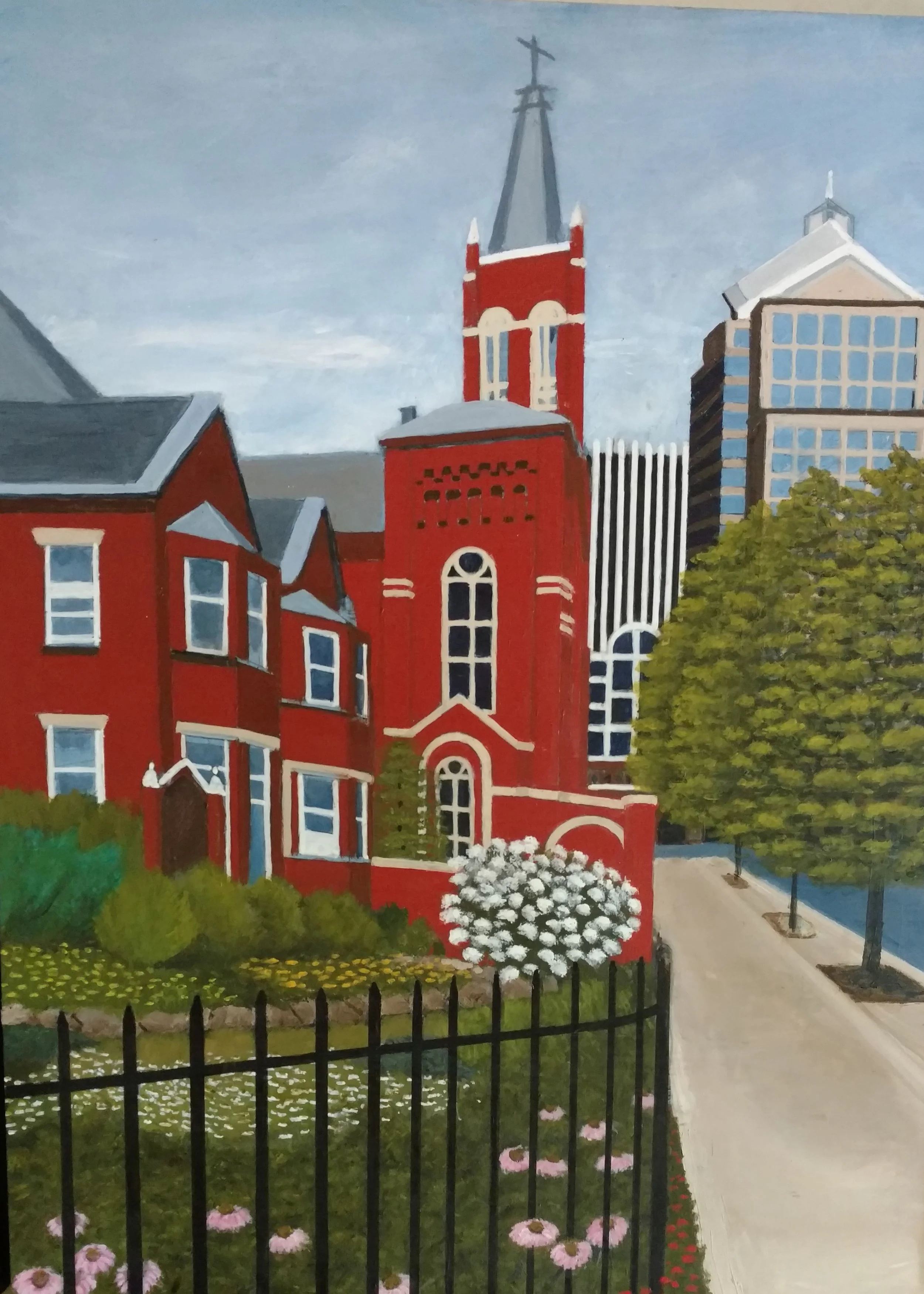
The 2nd image shows what this would look like. It is interesting, but rather ordinary at this point.
Finishing - Ink and Touch up.
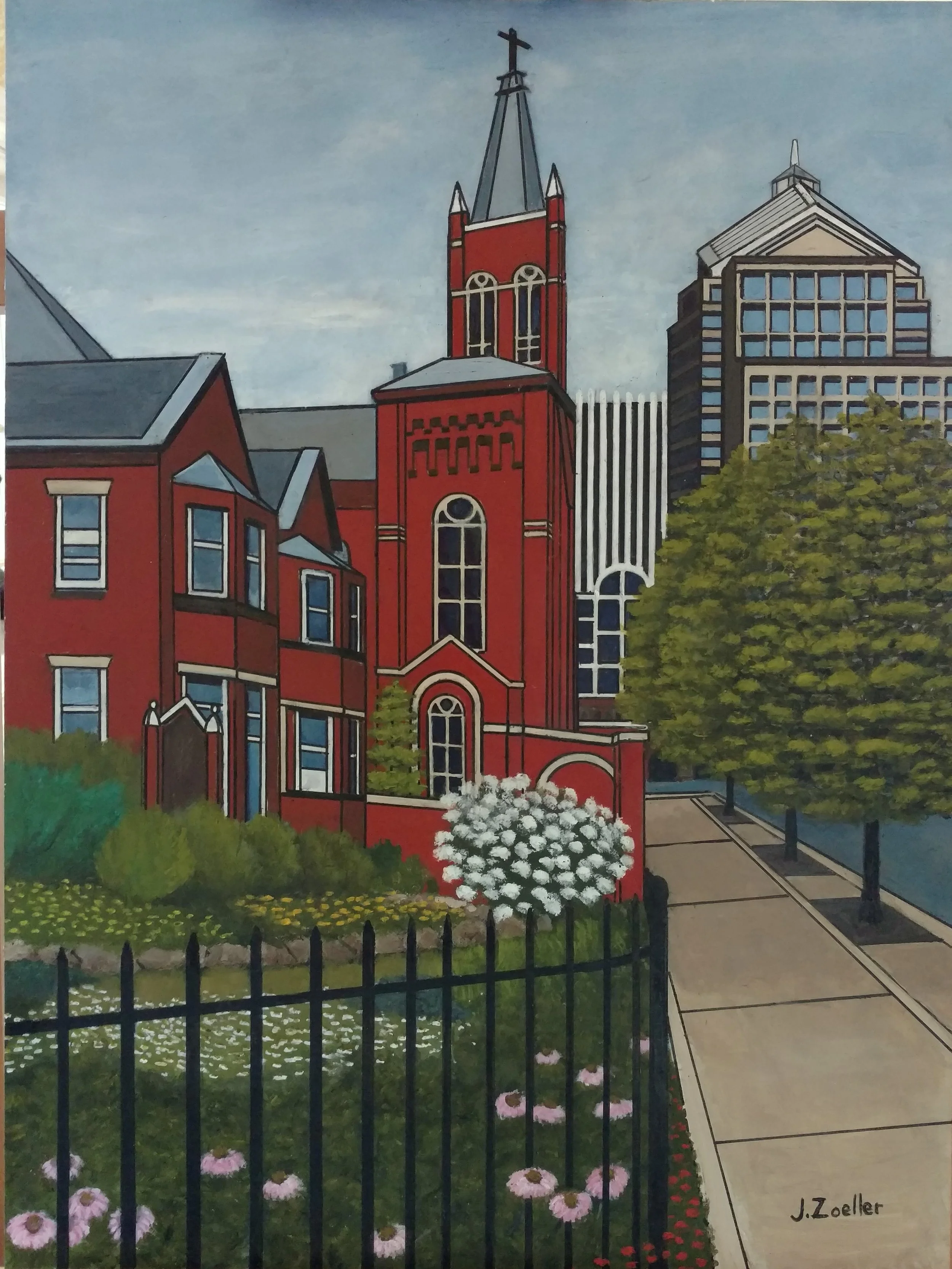
I create the final image by outlining the key images, normally using a black acrylic ink, although I have used other colors. For Architectural paintings, I only place highlights on the “hard” man made objects and possibly the trees, leaving leaves and flowers untouched. This dramatically changes the image as can be seen in image 3. The colors separate and darken while the perspective jumps out.
Varnish
I varnish my paintings, normally using three coats, the first being a gloss acrylic varnish, then two layers of satin varnish.


